
Radwave's main screen shows the spectrum. This contains the Power Spectral Density (PSD) on the bottom, with the Spectrogram above that, and some controls above that. If these words are completely foreign to you, then it should help to first read the blog post What in the world is the spectrum?
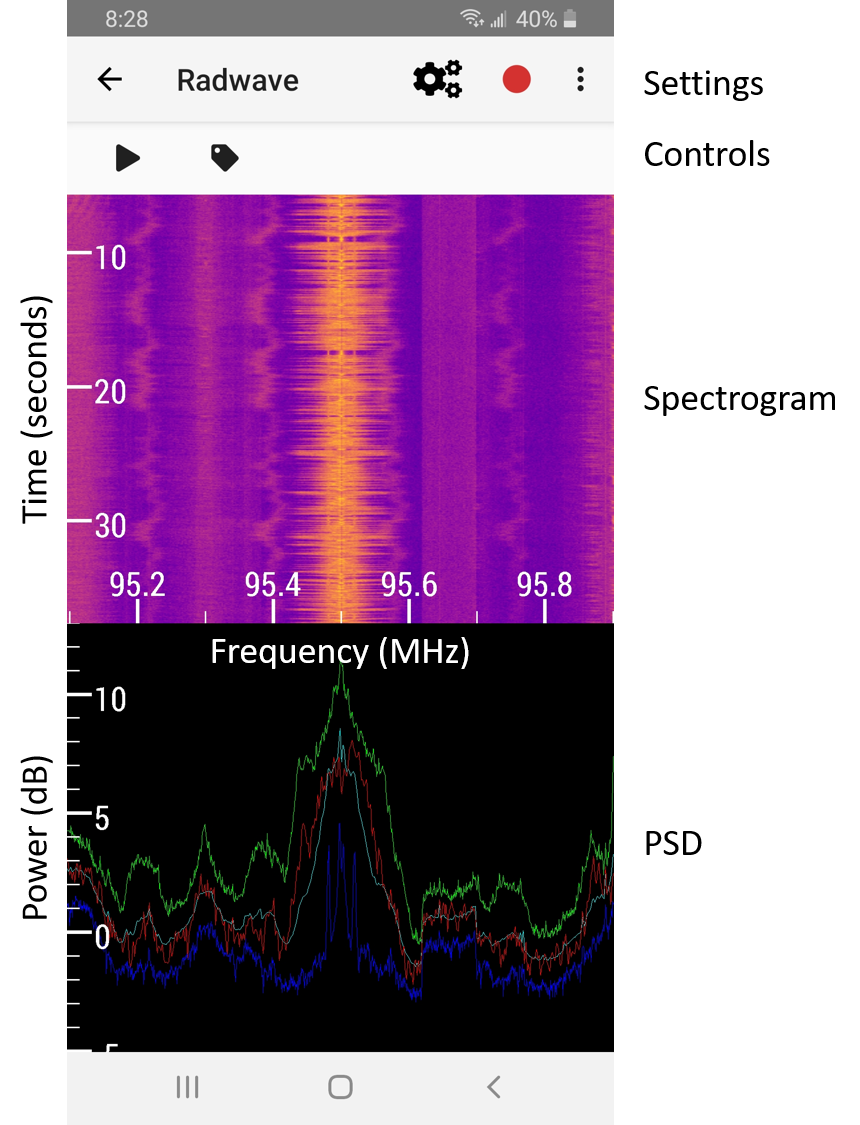
Spectrogram
The spectrogram is a colorized plot showing the signal energy over time as a function of frequency. Frequency is the horizontal axis with units of MHz. Time is the vertical axis with units of seconds. The color indicates the received signal energy, where bright/yellow indicates more energy than dark/blue.
The spectrogram supports full pan and zoom interaction. With zoom, you can stretch and pinch along each axis independently, allowing you to see the spectrum at various scales. Whenever your view changes significantly, data is fetched from the Radwave engine. With public collections, this requires network calls, potentially causing some lag in the user interface, particularly if your network speed to the Radwave servers in the AWS US East region is slow.
PSD Plot
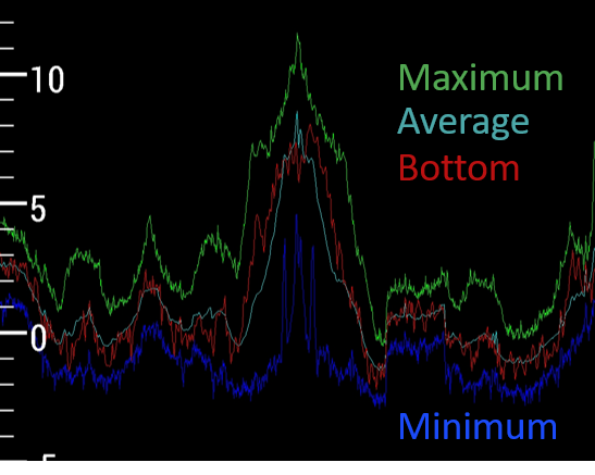
The PSD plot is a line plot showing the signal power as a function of frequency. It's aligned to the spectrogram plot above it, so frequency is the horizontal axis with units of MHz. Power is the vertical axis with units of dB. You'll notice four different colored lines.
The green one corresponds to the maximum power over the times shown in the spectrogram above it. So if there's a tiny blip of energy somewhere, you'll see a peak in the green line.
The blue one corresponds to the minimum power over the times shown in the spectrogram above it. This can be useful when interacting with it.
The cyan line corresponds to the average power over the times shown in the spectrogram. This is helpful for visually measuring the signal to noise ratio, i.e how strong the signal is versus the background noise around it.
The red line corresponds to the bottom row of spectrogram, making it the most dynamic.
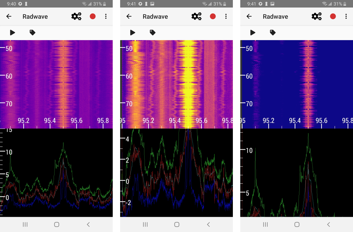
This PSD plot is also fully interactive, allowing you to pan and zoom through frequency and power. When you pan and zoom vertically through power, you'll notice that the colors change in the spectrogram. What's neat here is that our human eyes are sensitive not just to colors, but color differences, i.e. contrast. Contrast allows us to identify variations and textures. So by interacting with the PSD power, you give yourself an opportunity to view the spectrogram in a way that might make it easier to see features. This is particularly true when there's a strong interfering signal next to a weaker signal of interest. An example of this is shown in the pictures below, which all the same time and frequency region of an FM radio collection, but with different power scaling.
Control Buttons
Above the spectrogram are two control buttons. The play button allows you to see how the signals vary at real time speeds. The tag button saves your current view and describe it so that you can share it through social media, email, etc. You can view your list of tags by tapping , then Tags, making it easier to retrieve what you've already found.
Settings
When using Radwave locally with an RTL-SDR, there are a number of other settings to play with under . For details, see the blog post Settings for RTL-SDR. Once you've attached an RTL-SDR to your Android device, tap the button to start a live collection.